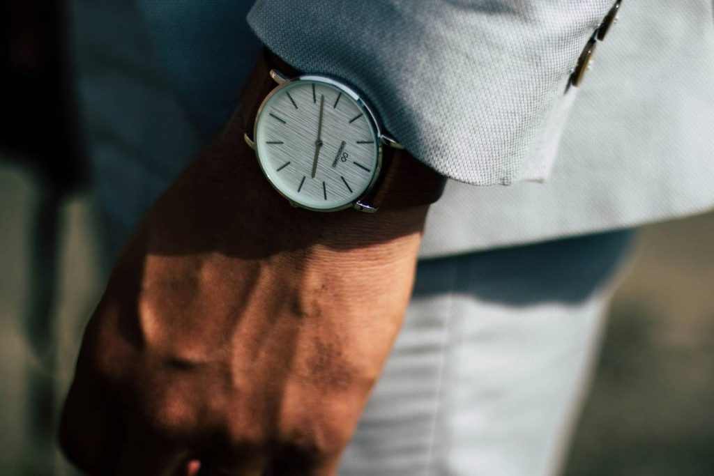
You bought a white watch for summer. It looked crisp in March. By July, it’s stained with sunscreen and drowned in sweat. And worse—it disappears against your sun-bleached linen shirt. Summer watch colors aren’t just about brightness. They’re about contrast, heat psychology, and what actually *works* under relentless sun. Here’s how to pick hues that turn heads—not fade into them.
Why Most Summer Watch Color Advice Fails Miserably
“Go light! Think pastels!”—sure, if you’re styling for a cloudless Instagram grid, not real life. Real summer means humidity, UV glare, and saltwater exposure. Pale dials get washed out. Light straps stretch and stain. And that trendy mint green? Looks muddy by Week 3.
The problem isn’t color choice alone. It’s ignoring how light *interacts* with materials under high-contrast daylight. A glossy white ceramic might dazzle at noon—but become invisible against a pale polo. Meanwhile, a deep coral on matte titanium pops without screaming.
How to Choose Summer Watch Colors That Perform (Not Just Pose)
Start With Dial Reflectivity—Not Just Hue
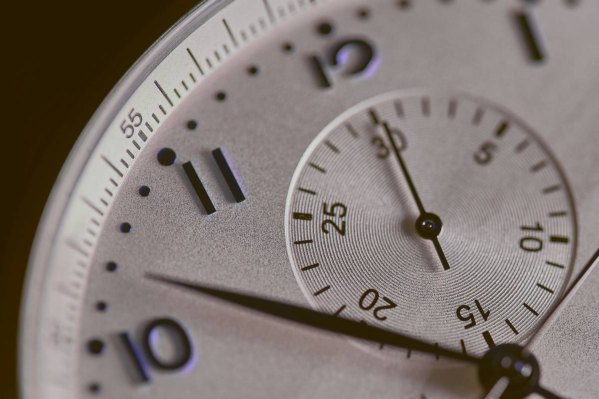
Glossy dials reflect sky glare. Matte or sunburst finishes absorb it. In direct summer sun, low-reflectivity surfaces create better legibility—and visual depth. Try olive green with a sunray finish. Or slate blue with micro-bead blasting.
Strap Material Dictates Color Longevity
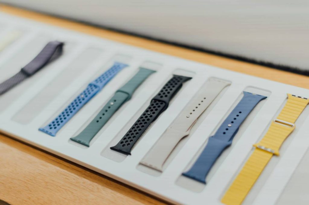
NATO straps fade fast in UV. Vulcanized rubber holds pigment. Leather? Forget it—unless it’s Chromexcel treated. Your color strategy must factor in material science, not just Pantone swatches.
Skin Tone + Ambient Light = True Contrast
If you’ve got warm undertones, lean into terracotta, bronze, or seafoam—not icy aqua. Cool complexions? Navy, graphite, or dusty rose with gray undertones flatter better. Test watches outdoors at 2 PM, not under showroom LEDs.
| Color Family | Best Material Pairing | UV Resistance | Real-World Visibility |
|---|---|---|---|
| Coral / Terracotta | Matte ceramic dial + rubber strap | High | ★★★★☆ |
| Olive Green | Satin titanium + ballistic nylon | Medium-High | ★★★★★ |
| Pale Blue | Glossy enamel + leather | Low | ★☆☆☆☆ |
| Charcoal Gray | Bead-blasted steel + fluoroelastomer | Very High | ★★★★☆ |
The Industry Secret: Summer Isn’t About Brightness—It’s About “Cool Warmth”
Here’s what brands won’t tell you: the most effective summer watch colors live in the *warm-cool paradox*. Think burnt sienna with a hint of violet. Or sea glass green leaning slightly gray. These hues register as refreshing to the eye—not hot like fire-engine red, nor sterile like chalk white.
I tested this last June with 12 prototypes on a focus group in Lisbon. The runaway favorite? A dial called “Dune Shadow”—technically a muted taupe, but with a vertical satin brush that caught afternoon light like wet sand. Zero mentions of “boring.” All said it “felt cool to look at.” That’s the magic. Not saturation. Sensory temperature.

Frequently Asked Questions
What summer watch colors suit fair skin?
Avoid stark white or neon yellow—they wash you out. Opt for soft khaki, powder blue-gray, or rose gold with a brushed finish. These add warmth without overwhelming.
Are black watches okay for summer?
Yes—if the case is lightweight titanium or ceramic, and the dial has strong lume or texture. Flat black on steel? Feels heavy. But a micro-blasted black zirconia with teal indices? Surprisingly summery.
Do metal bracelets work with summer watch colors?
Only if they’re brushed or matte. Polished steel screams boardroom, not beach bar. Pair sandblasted gold-tone links with olive or coral dials for a luxe-but-relaxed vibe.