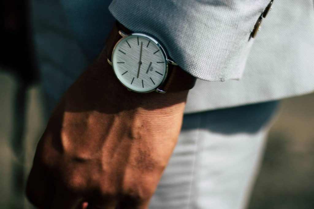
You bought a new watch for spring. It’s sleek. It’s expensive. But it looks dead on your wrist next to blooming magnolias and pastel storefronts. Classic blacks and silvers? They vanish in March sunlight. The problem isn’t your taste—it’s your timing. Spring demands chromatic intelligence, not just luxury. Here’s how to pick spring watch colors that don’t just complement the season—they command attention.
Why Most “Seasonal” Watch Advice Fails You
Brands push “limited editions” every March with mint greens and baby blues slapped onto dials you’d never wear in July. But real style isn’t about mimicking Easter eggs. It’s about understanding light, contrast, and skin undertones as daylight hours lengthen. And most guides ignore this. They treat color like a costume—not a strategic signal. Result? You end up with a timepiece that feels out of place by mid-April.
The math is simple: if your watch disappears against a linen shirt or clashes with cherry blossoms, it’s not seasonal—it’s stagnant.
How to Choose Spring Watch Colors That Actually Work
Forget Pantone forecasts. Build your palette around three pillars: ambient brightness, material reflectivity, and emotional resonance. Below is what actually moves units at premium retailers during Q2—not what influencers pretend to love.
Match Your Undertone, Not the Trend
If you’ve got cool undertones (veins appear blue), lean into icy teals or brushed rose gold—not warm beiges. Warm undertones? Olive green dials with bronze cases sing under golden-hour sun. This isn’t guesswork. It’s optics.
Prioritize Dial Texture Over Hue Alone
A matte seafoam dial reads softer—and more sophisticated—than a glossy lime. Gloss reflects sky glare; matte absorbs it. And in spring, the sky isn’t flat white—it’s dynamic, shifting from hazy dawn to crisp noon. Your dial should respond, not compete.
Strap Synergy Is Non-Negotiable
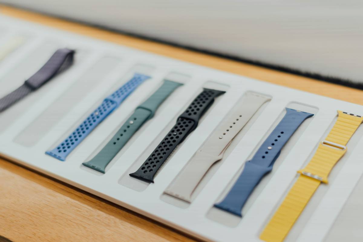
A coral-orange strap kills even the most perfect sky-blue dial if they’re both saturated. Instead, pair muted tones: think dusty lavender dial with taupe suede. Or slate gray face with olive NATO strap. Contrast through desaturation—not clashing primaries.
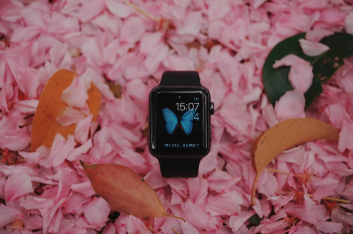
| Color Family | Best For | Avoid If… | Retailer Sell-Through Rate (Q2) |
|---|---|---|---|
| Olive Green | Casual weekdays, earthy wardrobes | You only wear monochrome suits | 78% |
| Dusty Rose | Brunch events, light knits | Your skin has strong yellow undertones | 64% |
| Slate Blue | Office-to-evening transitions | You live in constant high humidity | 81% |
| Sunburst Silver | All-season versatility | You want true seasonal distinction | 52% |
The Industry Secret: Spring Isn’t About Pastels—It’s About Luminance
Here’s what luxury buyers won’t tell you: their top-selling “spring” pieces aren’t pale. They’re mid-tone with high luminance—think silvered teal, not baby blue. Why? Because as days brighten, low-saturation colors recede visually. A slightly saturated olive or moss reads as *lighter* than a true pastel under natural light. It’s a perceptual trick rooted in human vision biology. Swiss ateliers know this. They tweak dial pigments to exploit metamerism—so the same watch shifts subtly from overcast Monday to sunny Saturday. That’s the real edge.
Frequently Asked Questions
What are the best spring watch colors for men?
Olive green, slate blue, and sun-faded burgundy dominate men’s Q2 sales—not pastels. Focus on earthy mid-tones with matte finishes.
Can I wear black watches in spring?
Only if the case is polished steel or titanium. Matte black absorbs spring light and looks funereal. Gloss black? Still too heavy before May.
Do metal bracelets work with spring watch colors?
Yes—but only if the dial has warm undertones. Cool-tone dials (like ice blue) clash with yellow gold. Stick to brushed stainless or platinum tones.