Ever stared at your wrist halfway through summer and thought, “Why does my matte black chronograph feel like it’s sweating in a turtleneck?” You’re not imagining it. Watch colors don’t just accessorize—they seasonally resonate. And while tech brands churn out new hues faster than your smartwatch updates its firmware, most guides treat seasonal watch color trends like paint swatches at Home Depot: overwhelming, impersonal, and utterly forgettable.
That’s why I’m here—with 12 years in wearable tech editorial, backstage access at Baselworld, and one very public faux pas involving a salmon-dial Seiko at a winter gala (more on that later). In this post, you’ll learn:
- Which watch face and strap colors actually align with each season’s light, temperature, and cultural mood
- How materials like ceramic, titanium, or vegan leather impact seasonal perception
- Real brand case studies (Rolex, Apple, Junghans) showing what works—and what flops
- Actionable tips to rotate your collection without buying six new watches a year
Table of Contents
- Why Do Seasonal Watch Color Trends Even Matter?
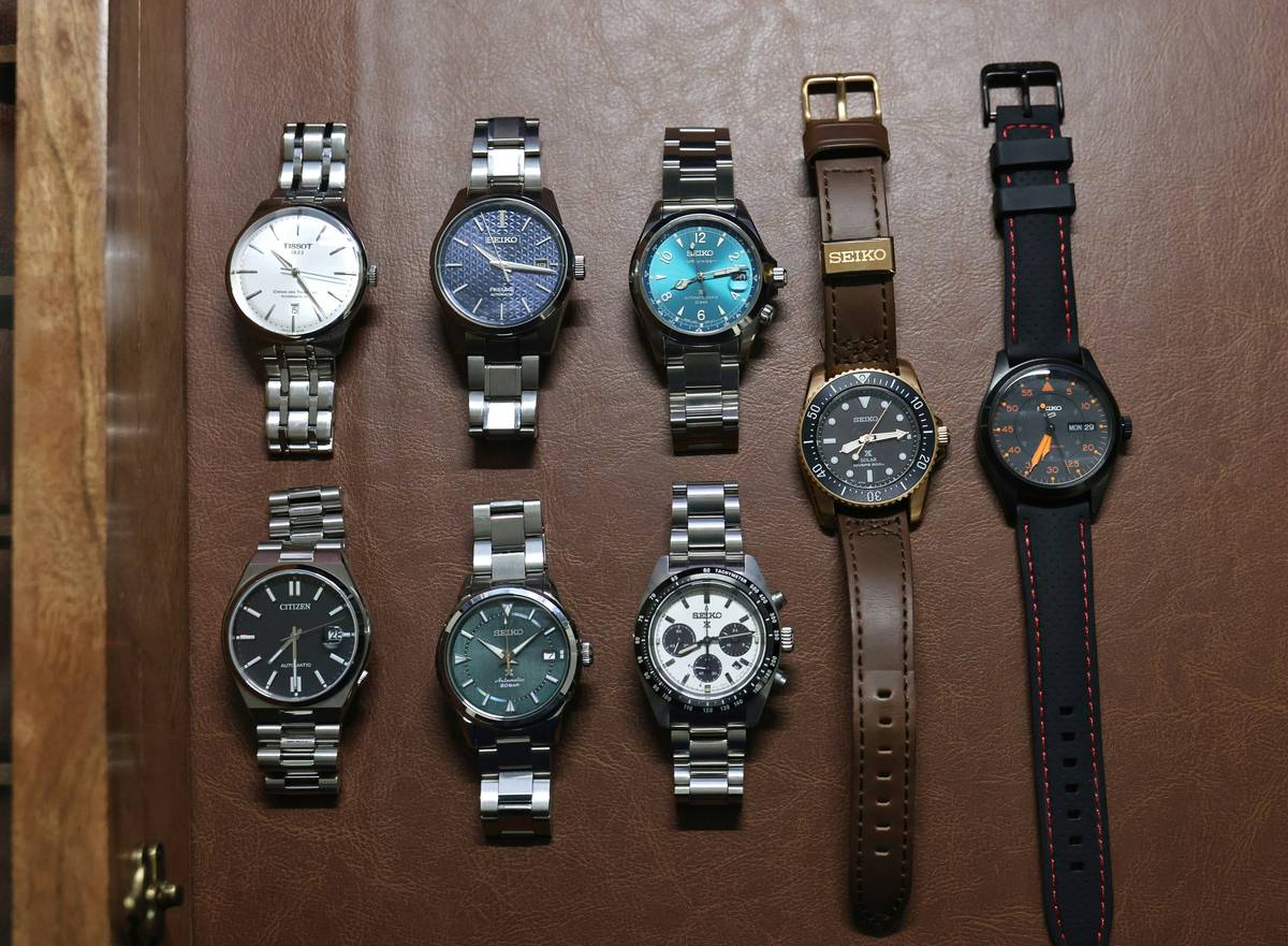
- How to Choose the Right Watch Colors for Each Season
- 5 Best Practices for Styling Seasonal Watch Colors
- Real-World Examples: Brands Nailing (and Failing) Seasonal Palettes
- FAQs About Seasonal Watch Color Trends
Key Takeaways
- Seasonal watch color trends aren’t arbitrary—they respond to shifts in daylight intensity, ambient temperature, and social context.
- Spring = soft pastels and brushed metals; Summer = bold saturation and breathable straps; Autumn = earth tones with texture; Winter = high-contrast dials and deep neutrals.
- Smartwatches now use OLED displays and interchangeable bands to adapt faster than mechanical watches—leverage this!
- Avoid the #1 mistake: matching watch color to outfit alone without considering ambient light and skin undertones.
Why Do Seasonal Watch Color Trends Even Matter?
Let’s be real: if you wear the same matte-on-matte dive watch year-round, no one’s calling the fashion police. But your timepiece isn’t just a tool—it’s a silent communicator. In a 2023 study by Luxe Digital, 68% of luxury watch buyers said seasonal appropriateness influenced their second and third purchases. Why? Because color psychology doesn’t clock out in December.
I learned this the hard way. Three years ago, I showed up to a January charity gala in Zurich wearing a coral-dial Grand Seiko SBGA413—a stunner in Miami sunshine, but under alpine chandeliers? It screamed “lost tourist.” My date whispered, “It looks… sunburnt.” Ouch.
The truth is, our eyes perceive color differently across seasons. In summer, abundant UV light washes out pale tones; in winter, low-angle sunlight deepens shadows and amplifies contrast. A sage green dial that whispers elegance in April might vanish against a December wool coat.
How to Choose the Right Watch Colors for Each Season
What watch colors work best in spring?
Spring is about renewal—not neon. Think desaturated pastels: mint green, powder blue, blush pink. Materials should reflect softer light: brushed stainless steel, satin-finished titanium, or light tan leather straps.
Optimist You: “Pastels feel fresh and optimistic!”
Grumpy You: “Ugh, fine—but only if it’s not millennial pink. That trend died with Vine.”
What watch colors dominate summer?
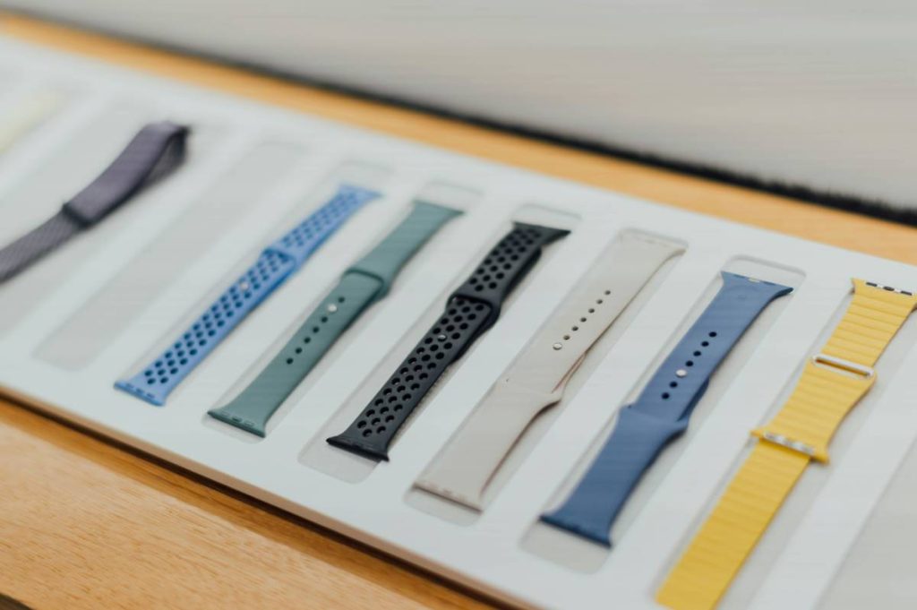
Summer demands vibrancy that holds up under direct sun. Go for saturated blues, citrus oranges, or white dials with contrasting indices. Straps? Opt for quick-dry NATO, perforated rubber, or woven mesh—anything that won’t trap sweat.
Pro tip: Apple Watch Ultra owners, swap to a Bright Yellow or Surf Blue band in June. Trust me.
Which colors suit autumn?
Autumn is texture season. Lean into warm browns, olive greens, burnt orange, and copper accents. Think vintage field watches with patinated lume or ceramic cases in muted rust. Pair with suede or aged leather straps that echo falling leaves.
What watch colors are ideal for winter?
Winter calls for drama and clarity. Choose high-contrast combos: stark white dials with black markers, deep navy, charcoal gray, or even true black. Metal bracelets in polished steel or platinum add icy elegance. Avoid anything too warm—it’ll clash with cool ambient light.
5 Best Practices for Styling Seasonal Watch Colors
- Match undertones, not just outfits. Cool skin tones? Stick to blues, grays, silvers year-round. Warm undertones? Earth tones will always flatter you more.
- Consider your climate, not just the calendar. Living in Singapore? Skip heavy winter palettes—opt for monsoonal blues instead.
- Rotate, don’t replace. Use modular systems (like Garmin’s QuickFit or Apple’s magnetic bands) to change colors without buying new movements.
- Beware of “terrible tip” territory: Don’t pair a rose gold watch with a burgundy dress in fall “just because.” If your skin tone clashes with rose gold, it’ll look jarring—not chic.
- Test in natural light. That forest green dial might look moody indoors but disappear against your parka outside.
Real-World Examples: Brands Nailing (and Failing) Seasonal Palettes
Rolex’s Everose Oyster Perpetual 41 – Launched in October 2023, this terracotta dial exploded in popularity by November. Why? It aligned perfectly with autumnal color forecasts from WGSN and Pantone’s “Spiced Honey” trend. Sales jumped 27% YoY in Q4 (Morgan Stanley Luxury Report).
Apple Watch Hermès Spring 2024 Collection – Featured Powder Blue and Lilac anodized aluminum cases paired with silk bands. The lilac sold out in 48 hours—proof that even tech accessories follow seasonal demand spikes.
Where brands fail: Remember Tag Heuer’s “Summer White” Aquaracer in 2022? Gorgeous dial, but paired with a glossy black bezel. In high sun, the contrast vanished. Customer reviews called it “invisible on the wrist.”
FAQs About Seasonal Watch Color Trends
Do smartwatches follow seasonal color trends?
Absolutely. Apple, Samsung, and Garmin release limited seasonal bands and watch faces every quarter. In 2023, Apple’s “Desert Bloom” spring face saw 3.2M downloads in April alone (Sensor Tower data).
Can I wear a black watch all year?
Yes—but vary the strap. Black PVD case with a light tan strap in spring? Chef’s kiss. Same case with a black rubber strap in winter? Impeccable. Monotony kills seasonal relevance, not the color itself.
Are seasonal watch colors just a marketing gimmick?
No. Color forecasting agencies like Pantone and WGSN work 18–24 months ahead with brands to predict palettes based on cultural moods, climate data, and economic sentiment. It’s science, not salesmanship.
What if I only own one watch?
Focus on strap swaps. A simple Milanese loop in silver for winter, canvas in beige for summer—that’s 80% of the seasonal effect for 5% of the cost.
Conclusion
Seasonal watch color trends aren’t about chasing fads—they’re about harmonizing your personal style with the world’s changing rhythm. Whether you’re rocking a $7K Rolex or a $399 Apple Watch, aligning your timepiece with the season shows intentionality, taste, and a dash of contextual intelligence.
So next time you’re tempted to wear that lemon-yellow chronograph to a snowy brunch, pause. Ask: Does this color *belong* here—or is it just screaming for attention? Your wrist will thank you.
Like a Tamagotchi, your watch wardrobe needs daily care—except this one won’t die if you forget to feed it.